
- Home
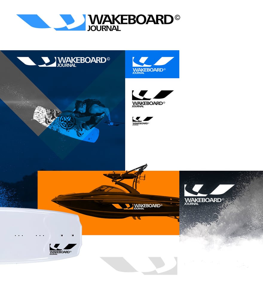
- Logostyle Wakeboard Magazine
Logostyle Wakeboard Magazine
Challenge: Create a fresh and recognizable visual identity
Wakeboard Magazine, an international magazine dedicated to wakeboarding, wanted to refresh its brand identity to better reflect the sport's dynamism and energy. The challenge was to develop a visual identity and logo style that both captures the essence of wakeboarding and appeals to a broad audience.
Solution: Development of a dynamic brand image and logo style
We developed an innovative brand image and logo style that reflect the movement and excitement of wakeboarding. With a modern, sleek design, we ensured the brand immediately stands out and makes a lasting impression. We also handled both internal and external branding, ensuring the new style was consistently reflected in all communications.
Result: A strong and consistent brand identity
The new visual identity has helped Wakeboard Magazine achieve stronger brand recognition and a more professional image. The updated logo style perfectly aligns with the target audience and strengthens the magazine's positioning in the market.
- Unique and dynamic design that captures the essence of wakeboarding.
- Consistent branding applied to all internal and external communications.
- Strengthened market position through a professional and coherent appearance.
Conclusion:
Working closely with Wakeboard Magazine, we developed a visual identity that captures the essence of wakeboarding and elevates the brand. This project illustrates how strategic design contributes to a strong brand identity and market position.
Curious about what we can do for your brand?
We are ready to work with you to create a unique and powerful brand identity that aligns with your vision and target audience.
Client:Wakeboard MagazineDisciplines:Graphic Design | BrandingSoftware:Adobe CS Illustrator + InDesign