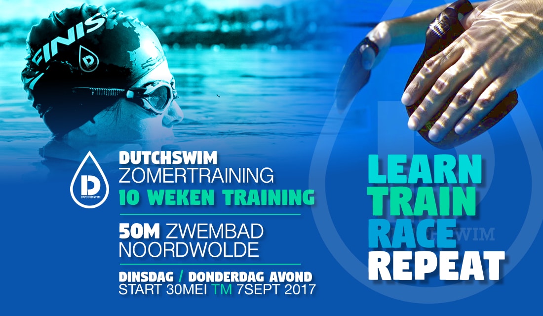
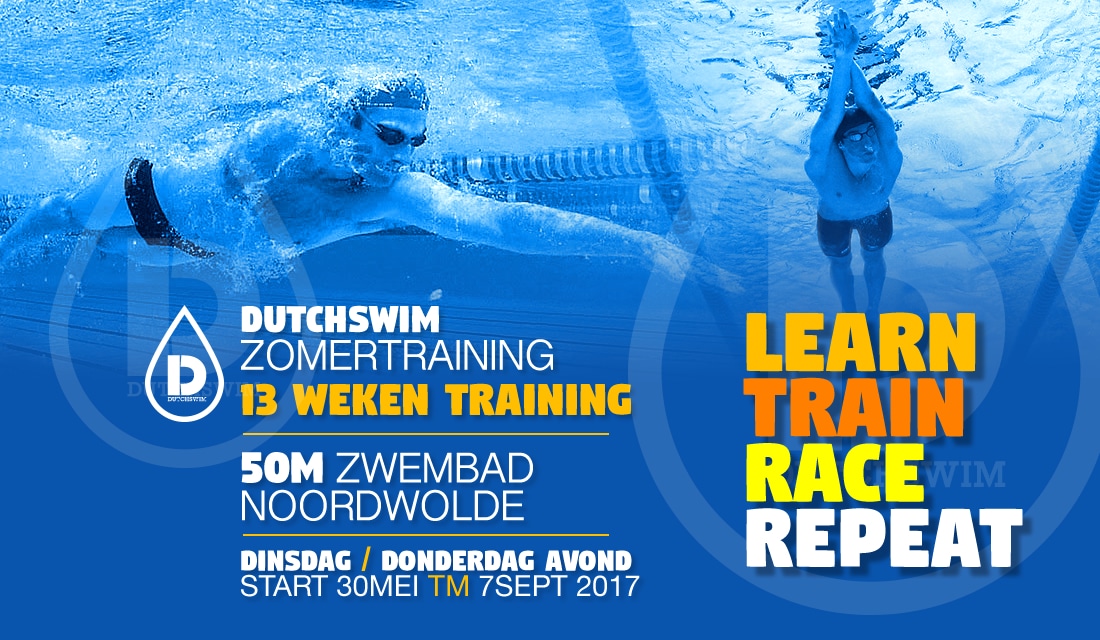
Dutchswim Magazine Web Banners
TVH Design has developed flyers and web banners for Dutchswim Magazine to promote their swimming training. With our professional web design advice, we have created a visual identity that exudes quality, movement and clarity.
The color blue not only symbolizes water, but also reliability. The powerful slogans and active accent colors reflect the core values of Dutchswim Magazine: active, focused on consumers and goal-oriented.
At TVH Design we understand the importance of attractive web advertisements to capture the attention of the target audience. With our expertise in web design and web banners, we can provide Dutchswim Magazine with effective promotional materials that present their course offerings in a convincing manner.
Client: Dutchswim Disciplines: Branding - Graphic design - Image optimization Software: Adobe CS Photoshop | Adobe InDesign Link: www.facebook.com


